Preliminary poster
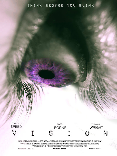
What I love about this poster is how simple it is, in which the main image is simply an unnaturally coloured eye, it goes with the title seeing as vision is associated with eyes. Also, the unnatural colour of the eye can be associated with the horror genre because of how surreal it looks and how the "unnatural" is a major trope to the genre.
Furthermore, the colours are contrasting seeing as white is the lightest tone and purple is a fairly dark colour, by the two colours contrasting each other, the main focus will be towards the purple iris. However, white is not a conventional colour for a horror poster, whereas black is known to be the most used due to the connotations with the colour, in which black represents darkness, death and hopelessness, whereas white is to represent the opposite of such.
The font I have used for the title is not too over complicated that the audience won't be able to read it, but it is "grungy" making it suited for the genre. Each letter is spread out in order for the title to fill the page, and it is second to largest on the poster, after the main image, so the audience will be able to identify the title easily. I have also placed the main actors for this "film" above the title so that the audience could recognise them and if they are a fan of one particular actor, then by seeing their name on the poster could peek their interest into the film.
For the tagline for this film, I have used the same font that I have used for my title making it match and stand out from the background. It reads "Think before you blink" which fits into the theme of the film and with it being above the eye that is wide open supports this fact that blinking is not really a safe option. It is also short and straight to the point, but it doesn't give the plot of the film away to an extent.
What I would do to improve is probably see any other themes that could go with the poster, so for example change the background colour or make it more distorted. Or I would change the font of either the title or the tagline or change the tagline to make it more unconventional or unique. Looking at this prelim task, I would take the minimalistic ideal and use it for my final poster, seeing as I prefer a simple poster than a busy one.


Comments
Post a Comment