Film double page spread analysis
In order for me to know what to put on my DPS, I have looked at various film articles from different magazines and out of the ones I have looked at, I picked two. Both from Empire, but are very different from each other.
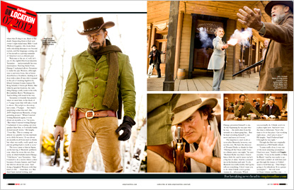
 Django Unchained: What I like about the structure of this article is how it states that it is on location and the date of when they filmed it. The images used vary between stills from the film and stills from the production. There are more images than text but this could be done to show the audience what to expect. Rather for them to read what will happen, they can see what will happen through the stills. What I will take from this DPS is the use of mixed stills. One from the actual film and one from the production. It would enable the audience to see what is going on "behind the scenes" without telling them too much information. Just to make them anticipated for the upcoming film.


Clash of the titans: Another DPS from Empire in which this time the title is going across the two pages. Unfortunately, I do not like how it looks in terms of position. I like the idea, but not how it was presented. But this DPS is different in which it has more text than images. The main image takes up half of the page and there is one smaller image that is placed between the two pages, both are stills from the film instead of being a mixture. However, the background of the actual article where the text is, consists of a pattern, probably so that the article will fit the theme of the film. Personally, what I feel that I can take from this article is the title going across the pages and possibly the idea of the main image taking one full page.


Comments
Post a Comment